Hierachical clustering and heatmap
Thang V Pham
05 March 2020
Quick start
Load the ion library and load an example dataset (or pointing to your local, tab-delimitated data file)
source("https://tvpham.github.io/ion.r")

d <- ion$load("https://tvpham.github.io/data/example-3groups.txt")
Check the data by using the head, tail, and dim functions. You should get something like the following in R.
head(d)In -omics data analysis, columns are usually samples and rows are genes/proteins. We are often interested in the up and down patterns of genes. Thus, the heatmap often shows the z-scores for each gene across samples (see the z-scores section below). We can show the heatmap and hierachical clusterings of d as follows
ion$heatmap(d)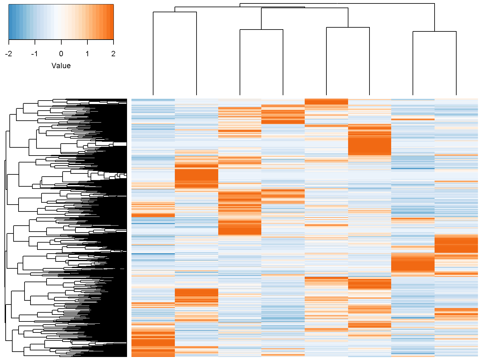
Z-scores
By default, the heatmap shows the z-scores of the data by row.The z-score transformation centers data around zero with unit variance \[ z = \frac{x-\mbox{mean}(x)}{\mbox{standard deviation}(x)} \]
Let us check with the first row of our data
x <- as.numeric(d[1,])
(x-mean(x))/sd(x)
## [1] 1.7883960 0.6197186 0.7384124 -0.1289654 -0.3115712 -0.4850468 -0.9415614 -1.2793822This should be the same as the first row of the transformed data
head(t(scale(t(d))), n = 1)## a1 a2 a3 b1 b2 b3 c1 c2
## [1,] 1.788396 0.6197186 0.7384124 -0.1289654 -0.3115712 -0.4850468 -0.9415614 -1.279382The value of the parameter z_transform can be set to "row" (default), "col" or "none". Type ?scale at the R console to know more about the scale function.
Row and column labels
We want to rotate the figure to show the sample horizontally with sample names and colors. Note that the function t() is a standard R function to transpose a matrix.
ion$heatmap(t(d),
            z_transform = "col",
            row_labels = colnames(d),
            row_label_colors = c("red", "red", "red", "blue", "blue",
                                 "blue","green", "green"),
            row_margin = 5)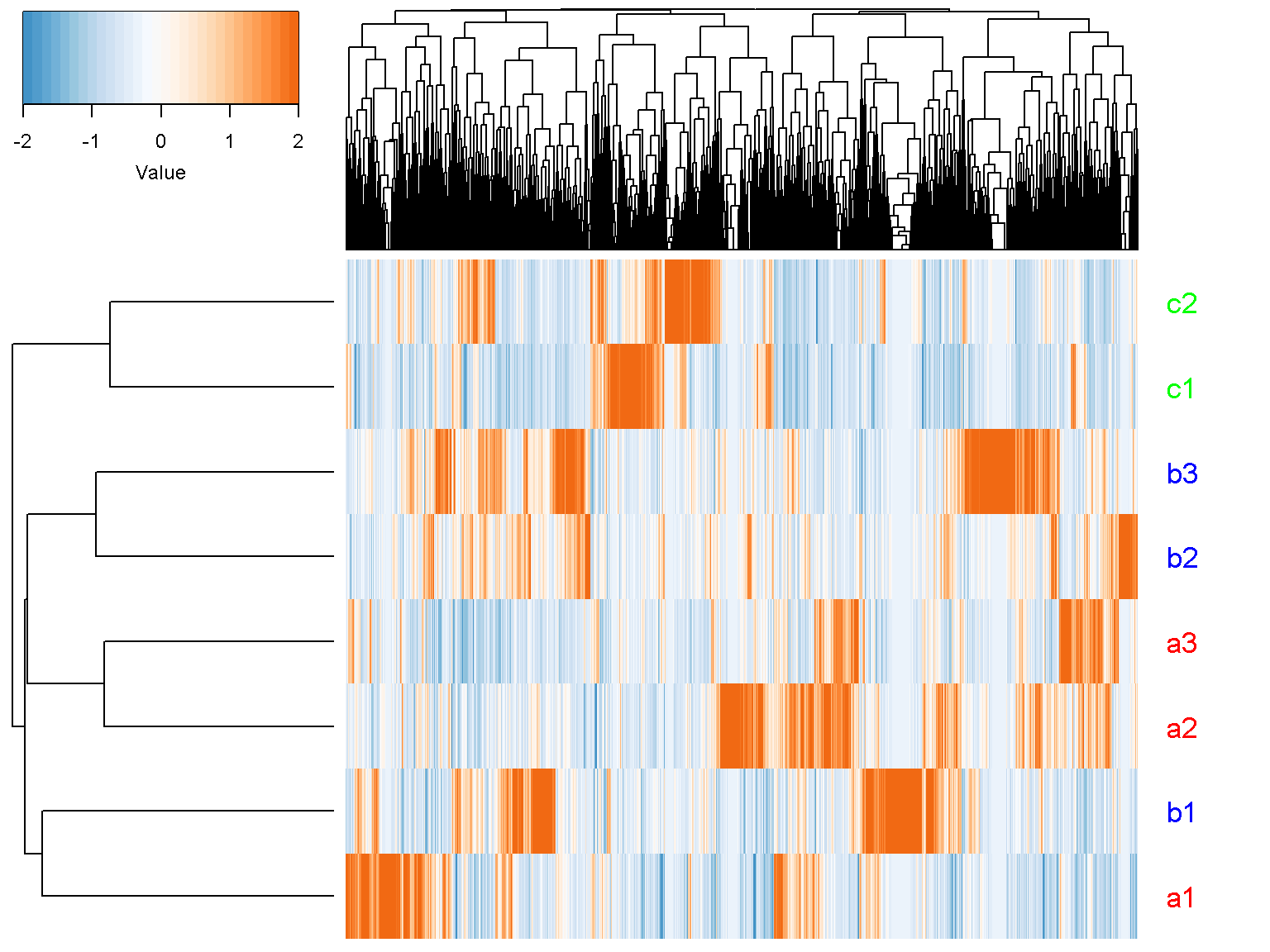
Label font size
Try to add parameter cexRow = 2.5 to get a more readable text labels (2.5 times bigger). If you have only a few rows (genes), it might be visually pleasing to add separators between cells by setting the separator parameter to TRUE. Let us try with the first 20 rows of our data
ion$heatmap(t(d[1:20,]),
            z_transform = "col",
            row_labels = colnames(d),
            row_label_colors = c("red", "red", "red", "blue",
                                 "blue", "blue","green", "green"),
            row_margin = 5,
            cexRow = 2.5,
            separator = TRUE)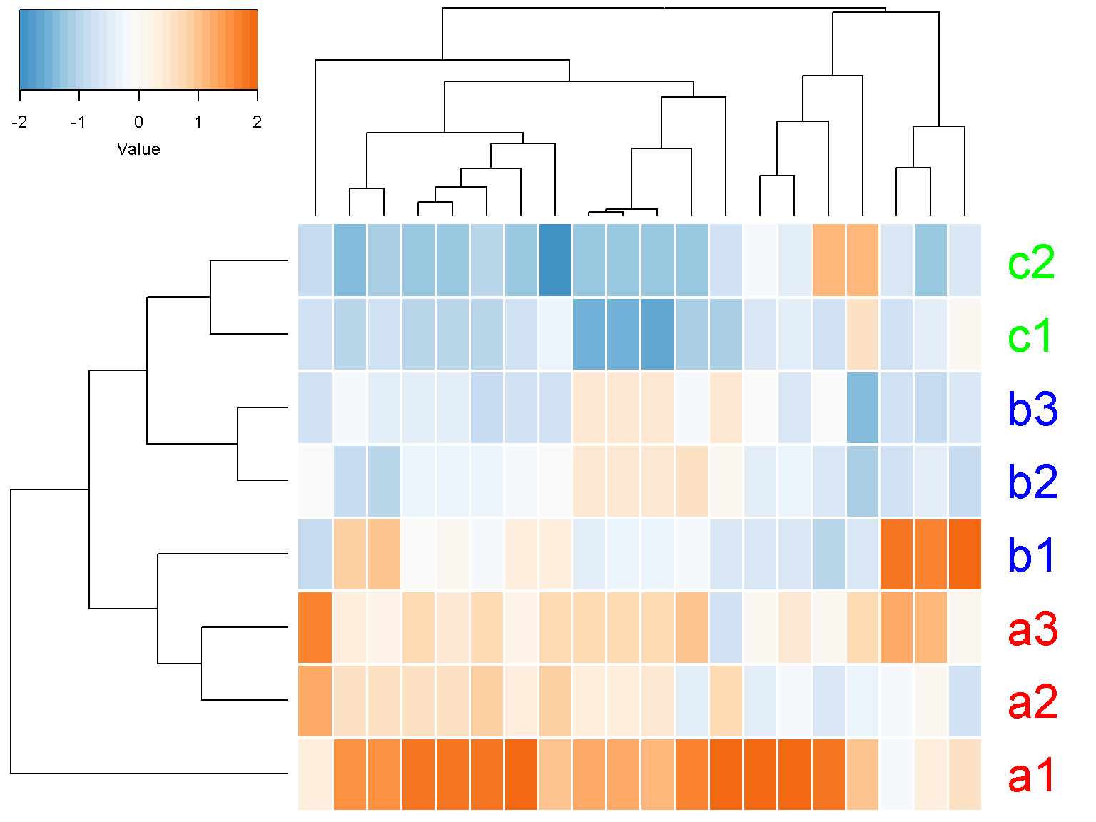
Color key code
Depending on the figure size, the color key might appear too big or too small. The parameter color_key_margins can be used. The defaul value is c(dev.size(“in”)[2]+0.5, 1, 0.5, 2). Increasing the first margin make the color key smaller.
ion$heatmap(t(d[1:20,]),
            z_transform = "col",
            row_labels = colnames(d),
            row_label_colors = c("red", "red", "red", "blue",
                                 "blue", "blue","green", "green"),
            row_margin = 5,
            cexRow = 2.5,
            separator = TRUE,
            color_key_margins = c(10, 1, 0.5, 2))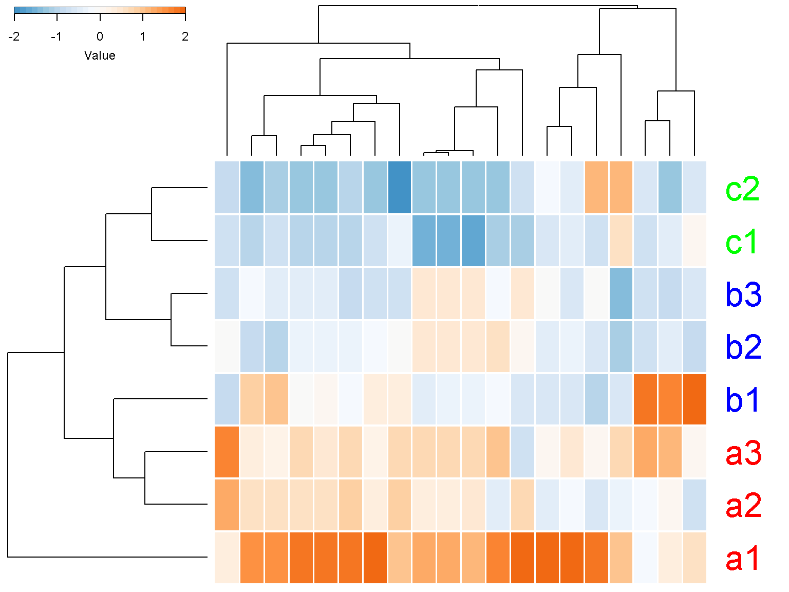
When the area for color is too small, R will report “figure margins too large”. When this occurs, the graphics state might be corrupted. Try dev.off() and reduce the color_key_margins to a smaller value, such as c(0.5, 1, 0.5, 2).
Top and left spacing
We can disable the color key (key = FALSE) and column clustering (col_data = NULL)
ion$heatmap(t(d[1:20,]),
            z_transform = "col",

            row_labels = colnames(d),
            row_label_colors = c("red", "red", "red", "blue",
                                 "blue", "blue","green", "green"),
            row_margin = 5,

            cexRow = 2.5,

            separator = TRUE,

            col_data = NULL,

            key = FALSE)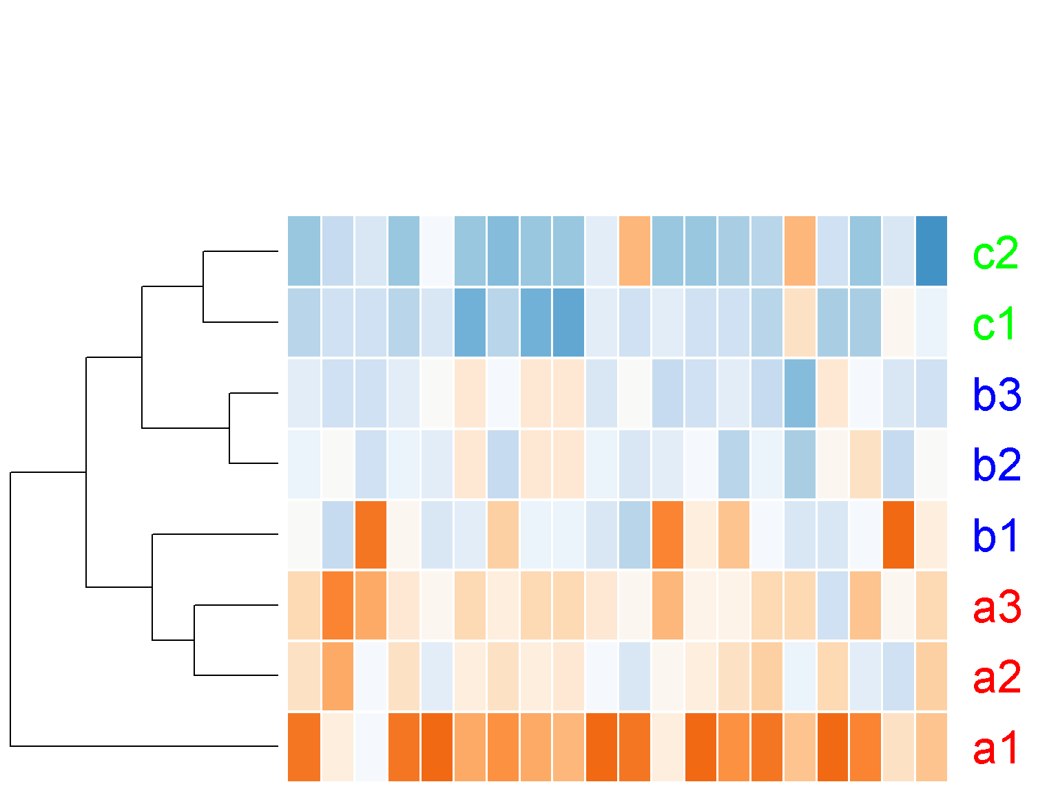
Notice the large white space at the top of the figure above. We can set the parameter lhei to remove this white space (similarly, lwid for the space on the left). This parameter should be a vector of 2 components, reflecting the ratio between the top space for the color key and the column clustering tree and the botton space for heatmap and the row clustering tree. The default value of c(1.5, 4) means that the height of the heatmap should be 4/1.5 ~ 2.7 times bigger than the top space. By making the space for heatmap much bigger than the top, we effectively remove the top space.
ion$heatmap(t(d[1:20,]),
            z_transform = "col",

            row_labels = colnames(d),
            row_label_colors = c("red", "red", "red", "blue",
                                 "blue", "blue","green", "green"),
            row_margin = 5,

            cexRow = 2.5,
            separator = TRUE,
            key = FALSE,

            col_data = NULL,

            lhei = c(1, 100))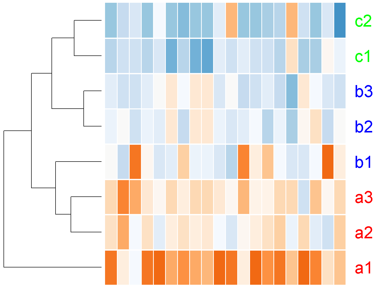
We can turn off the row clustering as well (row_data = NULL)
ion$heatmap(t(d[1:20,]),
            z_transform = "col",

            row_labels = colnames(d),
            row_label_colors = c("red", "red", "red", "blue",
                                 "blue", "blue","green", "green"),
            row_margin = 5,
            cexRow = 2.5,
            separator = TRUE,
            key = FALSE,

            col_data = NULL,
            row_data = NULL,

            lhei = c(1, 100),
            lwid = c(1, 100))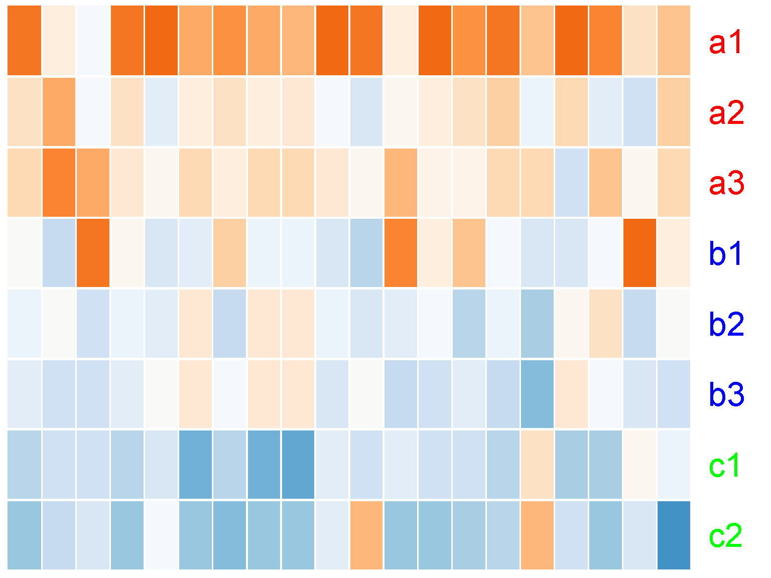
Display raw data
If you do not want to display z-score data, set z_transform to "none", and provide a new color palette. This is because the default palette is suitable for z-score data only. We will try a palette with 32 colors going from yellow to green as follows
ion$heatmap(d,
            z_transform = "none",
            color = colorRampPalette(c("yellow", "green"))(32))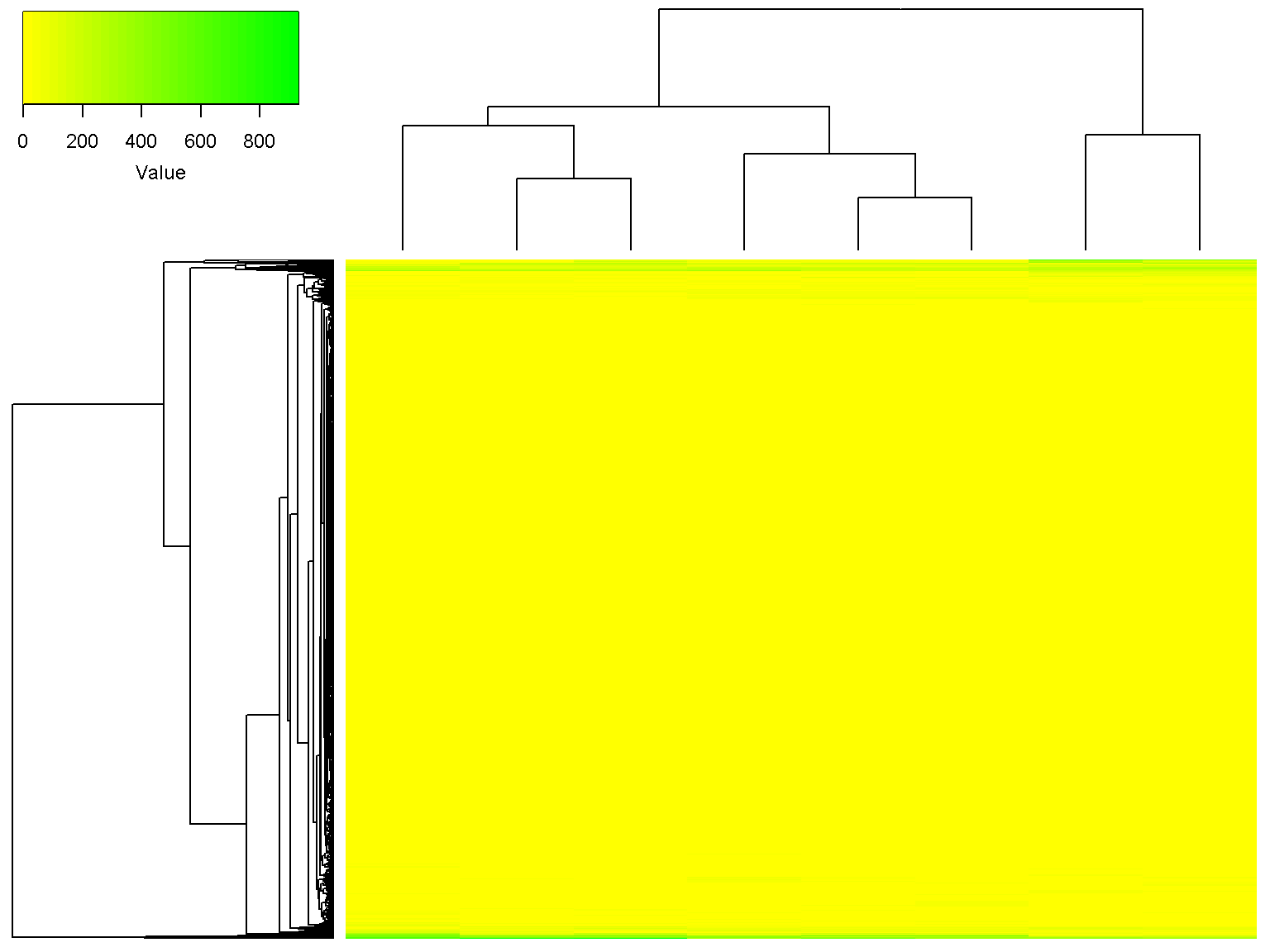
It can be seen that the some rows are more intense than others across all samples (you decide if that is interesting!). We can set a minimum value and a maximum value for the heatmap as follows (values outside of the range will get the extreme colors).
ion$heatmap(d,
            z_transform = "none",
            color = colorRampPalette(c("yellow", "green"))(32),
            color_min = 5,
            color_max = 30)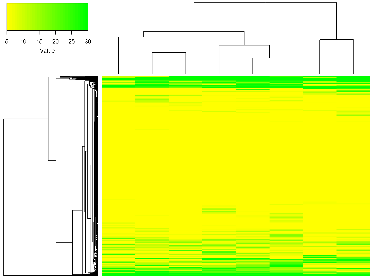
Clustering parameters
We can ignore the row clustering by setting row_data to NULL, and in addition, use the Spearman distance (1-Spearman correlation) for column clustering.
ion$heatmap(d,
            z_transform = "none",
            color = colorRampPalette(c("yellow", "green"))(32),
            row_data = NULL,
            col_distance = "spearman")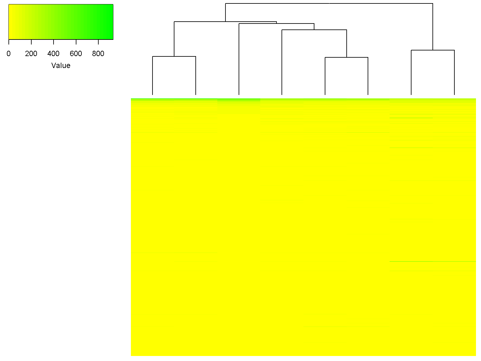
Note that the dendrogram for columns has changed. We can use the Spearman distance and Ward linkage for column clustering while using z-scores for heatmap and default clustering for rows
ion$heatmap(d,
            z_transform = "col",
            col_data = d,
            col_distance = "spearman",
            col_linkage = "ward.D2")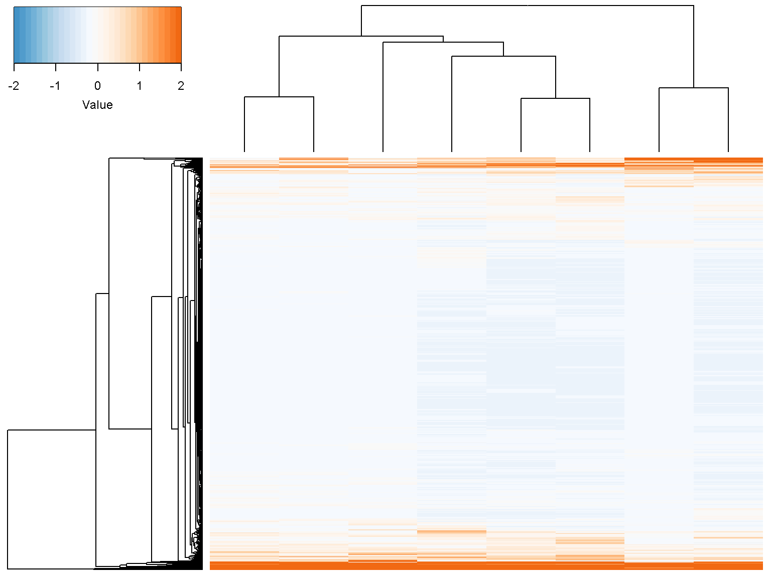
Extra column annotations
To display multiple color (or character) bars on top of the columns for extra data annotation, set the parameter col_color_bar to a list where each element corresponds to a color bar. For example
ion$heatmap(d,
            col_color_bar = list("Subtype" = c("red", "red", "red",
                                               "blue", "blue", "blue",
                                               "green", "green"),
                                 "MSI status" = c("", "",
                                                  "", "+",
                                                  "+", "+",
                                                  "+", "+")),
            col_data = d,
            col_distance = "spearman",
            col_linkage = "ward.D2")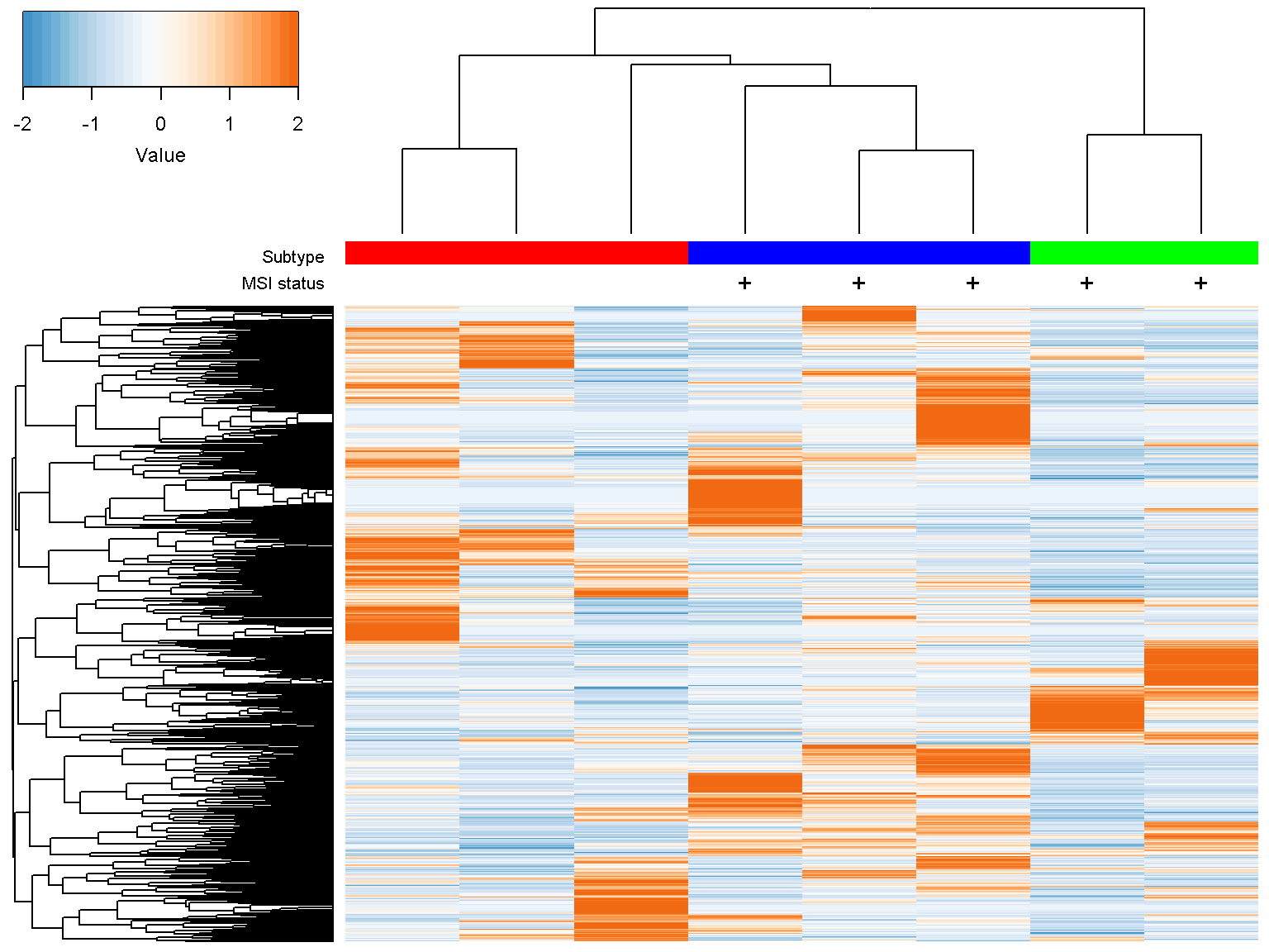
We now add labels to columns as for rows. By default, column labels are rotated by 90 degree. We can alter this with the parameter col_label_rotated
ion$heatmap(d,
            col_color_bar = list("Subtype" = c("red", "red", "red",
                                               "blue", "blue", "blue",
                                               "green", "green"),
                                 "MSI status" = c("", "",
                                                  "", "+",
                                                  "+", "+",
                                                  "+", "+")),
            col_data = d,
            col_distance = "spearman",
            col_linkage = "ward.D2",
            col_labels = colnames(d),
            col_label_colors = c("red", "red", "red", "blue",
                                 "blue", "blue","green", "green"),
            col_margin = 5,
            cexCol = 2.5,
            col_label_rotated = 45)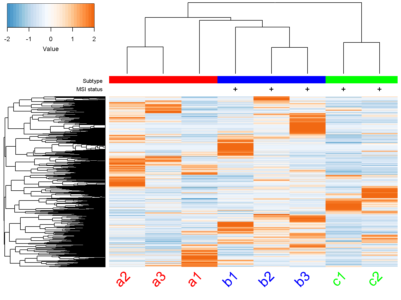
Legends
To include additional annotations or figure legends, we make the bottom margin col_margin or right margin row_margin bigger and plot over the figure.
ion$heatmap(d,
            col_color_bar = list("Subtype" = c("red", "red", "red",
                                               "blue", "blue", "blue",
                                               "green", "green"),
                                 "MSI status" = c("", "",
                                                  "", "+",
                                                  "+", "+",
                                                  "+", "+")),
            col_data = d,
            col_distance = "spearman",
            col_linkage = "ward.D2",
            col_labels = colnames(d),
            col_label_colors = c("red", "red", "red", "blue",
                                 "blue", "blue","green", "green"),
            col_margin = 5,
            cexCol = 2.5,
            col_label_rotated = 45,
            row_margin = 7)

par(mar = c(0, 0, 0, 0), fig = c(0.9, 1, 0, 0.7), new = TRUE)
plot.new()
legend("topleft", c("A", "B", "C"), col = c("red", "blue", "green"),
       pch=15, pt.cex=1.5, bty = "n")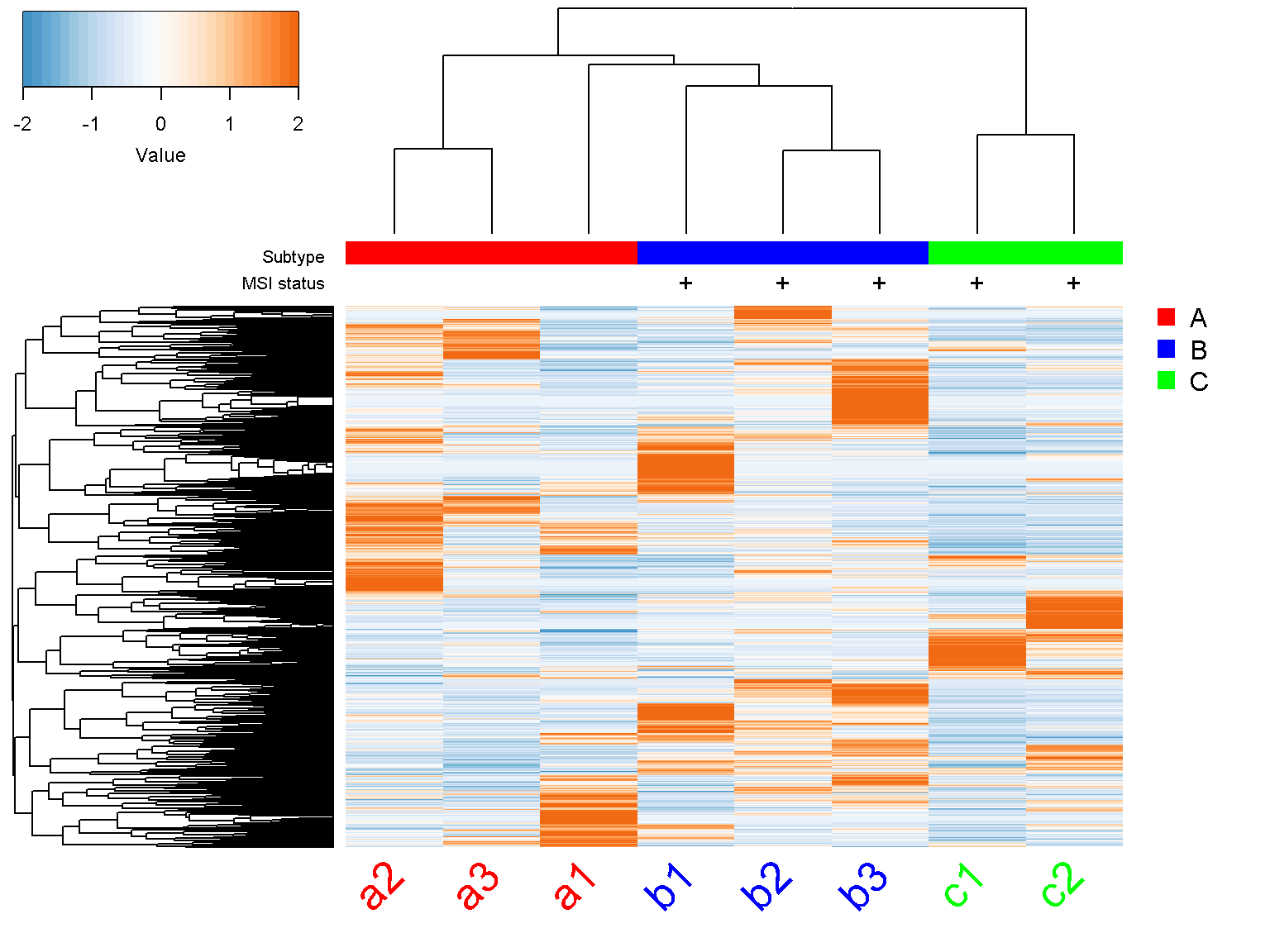
Troubleshooting
When R cannot make the intended graphical draw because of the lack of drawing space, make the graphics device’s drawing area bigger or the color key margins smaller. Usually, it is necessary to clean up graphics errors by calling dev.off().